Identify possible causes for low conversion rates on Good Sam’s Roadside Assistance plans.
Challenge
Background
Approach
We decided to start broad to be able to fully understand the users journeys and habits. Casting a wide net was also due to limited business data resources which we would have utilized for big picture things like time spent on pages and locating dropping off points.
My role
Lead UI/UX Designer
Research
User testing
Wireframing
Prototyping
UX strategy
Supporting role
I was able to utilize another designer from our team, Jon Kula, throughout this project. Being able to whiteboard ideas and work through optimal user testing scenarios together ensured our process was being covered from multiple angles.
The process
Our process was designed similarly to most processes being used today. It is based around the scientific method; defining the problem, formulating hypotheses, testing those ideas, and learning from our tests and users. Our process is not linear by any means, this allows us to reset and adapt to any findings along our journey.
Research and testing
Architecture audit
Research
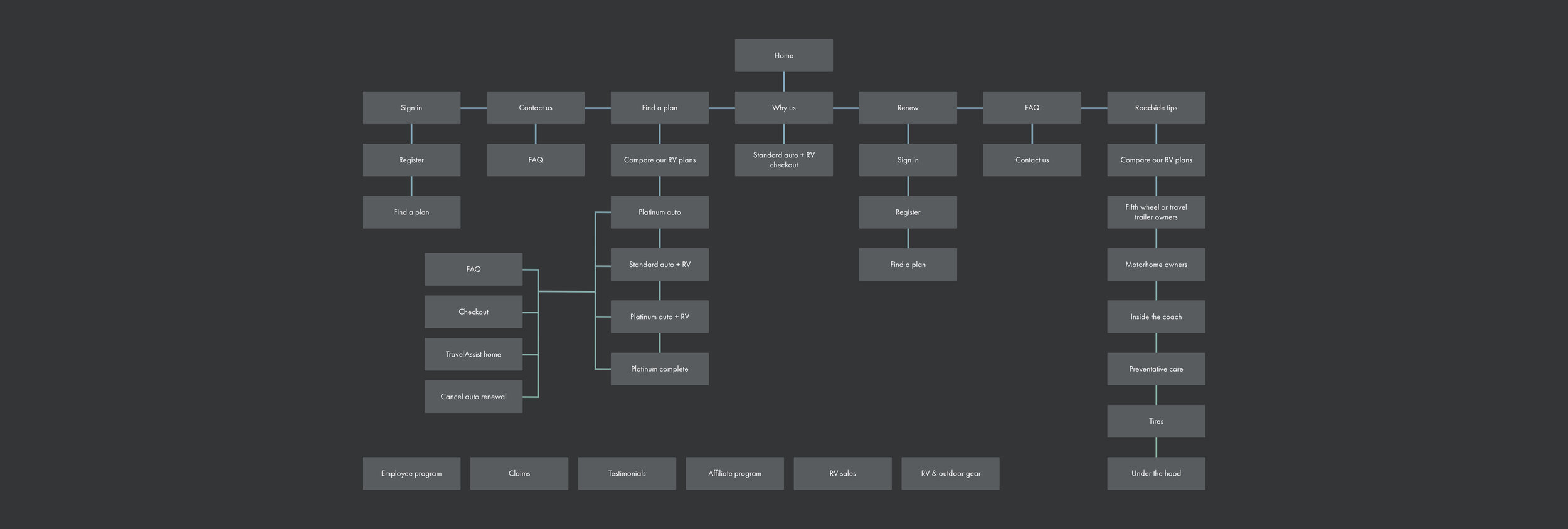
To start, we conducted an architecture audit which allowed us to get a 30,000 foot view of all of the different flows a user could potentially take while on the site. This also opened our eyes to the ample amount of information that was being displayed to the user.
Exploratory study
Research / User testing
For this study we provided the user with a set of tasks to see how they would navigate through the site, preform the tasks, and if they could successfully complete the task. Users were also providing attitudinal feedback on things like their feelings and needs from the site.
Competitor study
Research / User testing
After running the exploratory study, we wanted to see how the user would run through the same exact tasks on a direct competitor’s site. This study allowed us to see what worked well and what did not so that we could implement new features or improve upon any overlapping features.
““Good Sam feels cartoonish...””
Preference study
Research / User testing
Once both tests were completed, the users were then ask to give their preference on different aspects of both sites. This helped give us a baseline in understanding what our users preferred from our site as well as the competitor’s site.
Scroll / heat maps
Research
We wanted to see how much of our current pages were actually being viewed and what elements were being interacted with. These maps helped us inform the business on how our users both navigate and fail to navigate our site.
Key takeaways
UX strategy
Gathering and analyzing all of our learnings and discoveries helped us identify reoccurring pain point patterns that users continued to cross paths with.
Exploring solutions
UX strategy
How can we solve what we’ve come to understand so far? We didn’t want to hold ourselves back so we simply asked ourselves, what are some extreme ways and what are some conservative ways we could solve this?
Wireframes
UX design
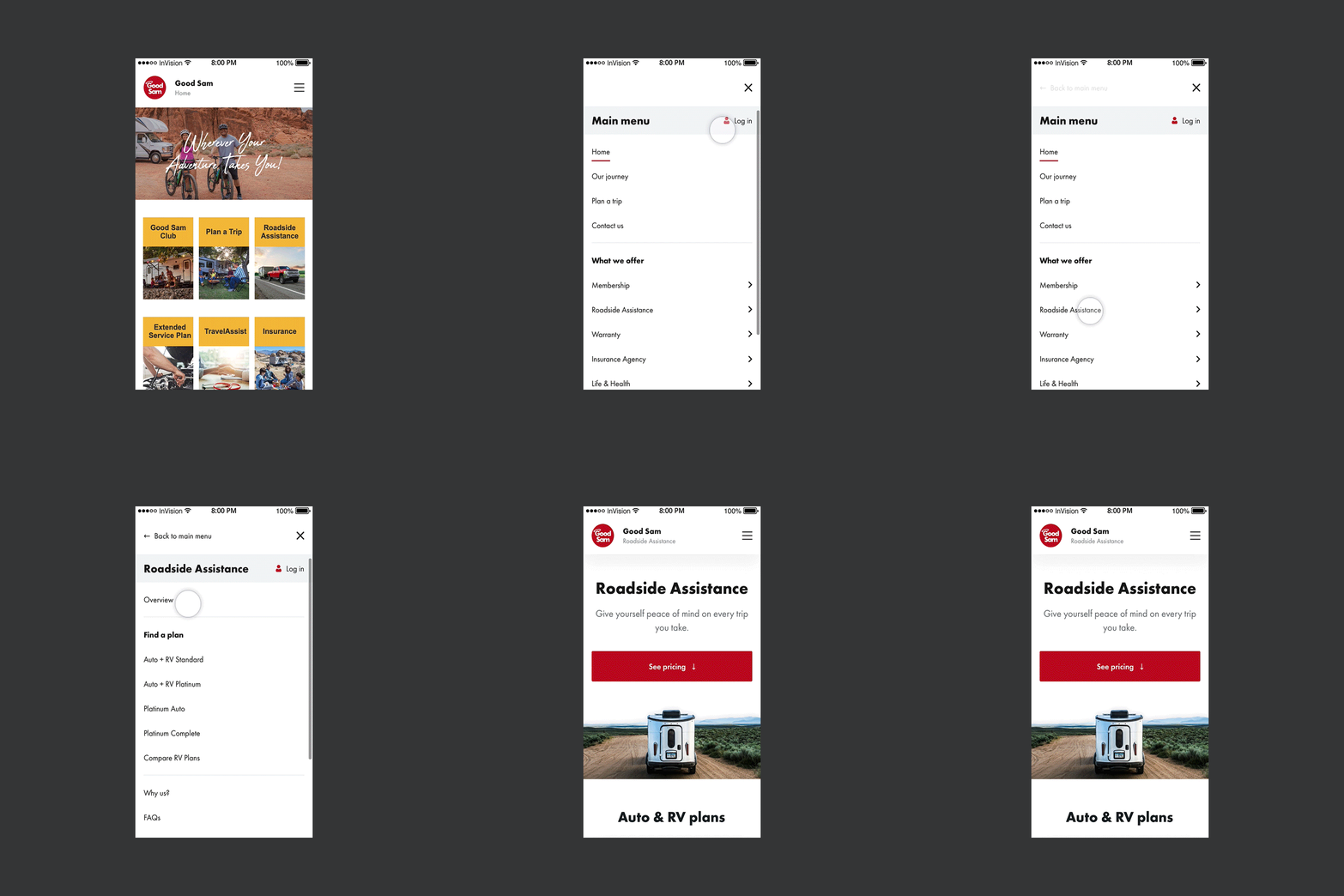
Some of the explored solutions were green lighted and some were going to be implemented in later phases. Our focus was now turned towards cleaning up flows and optimizing for mobile.
Since optimizing for mobile was one of our main focuses, we wanted to make sure the optimizations happened across all device sizes. Ensuring an unobtrusive transition from one device to another needs to be seamless for our users. Having an updated responsive design allowed us to achieve this.
Mockups
UI design
Prototype
UI design
We used Invision to prototype our designs so that we could observe exactly how the user interacted with the designs, for better or worse. The prototypes were also a valuable tool that gave us quick results without having to spend time and resources on building out a fully functioning flow.
““I would be able to navigate this page and get a plan with ease.””
What I learned
Simplify the experience
Overeducating the user becomes a problem because it over stimulates and distracts the user from the purchase. On the flip side, under-educating the user becomes a problem because the user doesn’t feel confident that they have been given all of the information needed to make a confident purchase.
Finding the sweet spot between the two is where our challenge lies. By simplifying the experience, the user will be less likely to get lost in the multitude of flows, will be less likely to get overwhelmed by the amount of content, and will be more well equipped with all the information they would need to make a purchase.
Focus on being user-centric
We started the project with the mindset to turn each page inside and out so that we could empathize with our user and experience what they go through while learning about our plans and the journey of purchasing them.
Making sure that users voices and opinions are heard, analyzed, and actioned on is the biggest takeaway for me. The user has a wealth of knowledge and insight that’s waiting to be discovered and all we have to do is engage and interacted with them.


